Journal / 2012-12-20
The Little Things
I’ve come to realize that I am a bit of a perfectionist. Actually, I’ve known this for a while, but it’s become pretty apparent lately. And I can’t decide if it’s a good or bad thing. When it comes to agile development, it probably does more harm than not. I have a hard time implementing a solution without ensuring that the solution is the very best. However, I’ve learned that it is almost impossible to come up with this “ideal” solution from the beginning. Thus, I usually end up wasting a lot of time either planning or implementing unnecessary features.
Needless to say, I am on a continuous search for a method that will ultimately yield optimal efficiency without compromising quality. I think the answer lies within the planning process – as in explicitly defining the steps I should take and sticking to those steps. But in order for this to work, one needs to be able to account for all sorts of variability and essentially envision the final product without thinking twice. This is something I simply cannot do. Maybe I’ll figure it out someday, but for now, I’ll just have to work with what I’ve got.
But the real point of this post is not to belabor the negative aspects of perfectionism – I’m just going to have to learn how to deal with those. What I really want to discuss is the application of this idea to interface design. Yes, we’re talking little big details: the kind of stuff that most people don’t think twice about. The kind of stuff that perfectionists like me can’t stop thinking about.
My final project for Web Apps this semester was a relatively simple location-based project built with PHP, MySQL and Google Maps API. As the project wasn’t necessarily technically challenging, I spent the majority of my time working on the interface. The final product exemplified some of what I believe are the best practices in interface design.
Submit buttons. Just about every interaction on the web incorporates an HTML form in one way or another. And with this form, there is most likely a submit button. First and foremost, spend some time on the :hover and :active interactions. Users like to feel like they are doing something when they are interacting with your site. However, these interactions should be subtle: users shouldn’t notice them, they should expect them.
While most sites at least address these interactions, few address what happens after a user has clicked the submit button. At the very least, attach a readonly attribute on click. People are impatient, and the last thing a server needs is a bunch of the same complex queries to run. However, I suggest taking it one step further: actually change the value of the submit button to an appropriate verb. For example, a registration form’s submit button would change to a read-only “Registering…” button the second a user releases the mouse. In this manner, users will have no question that their request is being processed despite the uncontrollable server lag.
Dialogue. Believe it or not, users are real people. So why do so many web apps treat them like machines? Don’t underestimate the dialogue you initiate. Use first names instead of usernames. I’m even an advocate for informal language. On form inputs, include descriptive placeholder text, but don’t be afraid to use labels as well. Implement a nonintrusive, uniform notification system. Just remember that in the end, a great interface should be intuitive without requiring a lot of descriptive text.
Colors. Don’t use black; don’t use white. They’re not realistic. Other than that, I really can’t say I know much about color other than what looks good. When listing similar content in a table or list, alternating the row colors is almost always a must; however, the key is to find the threshold that is just barely noticeable. The alternation is not there to take away from the content; it is there to help understand it.
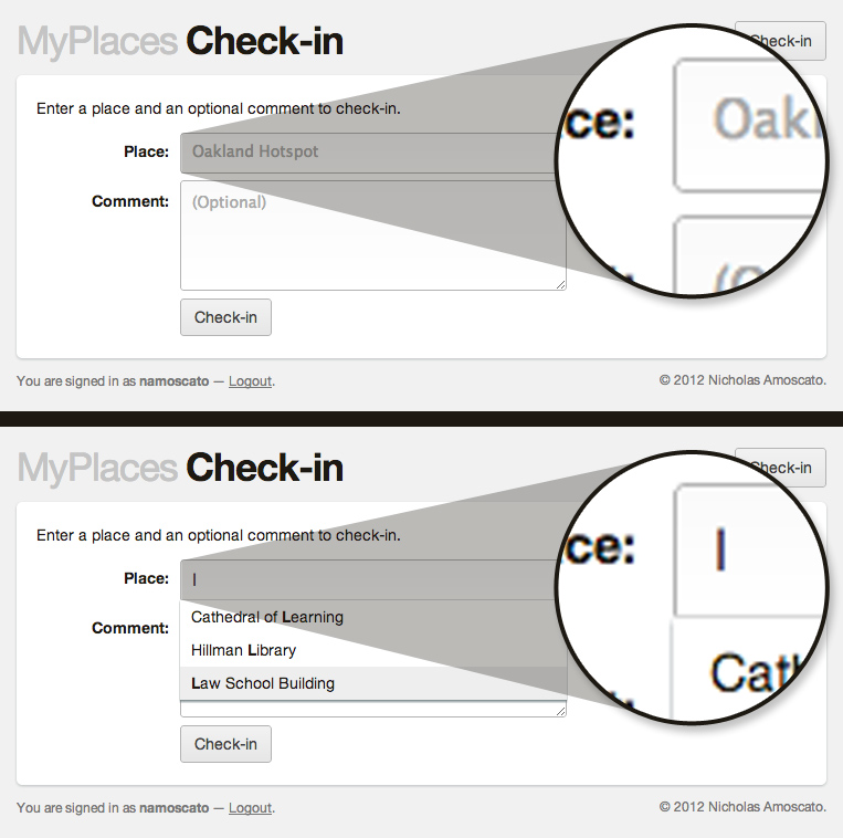
Autocomplete. This could probably end up being a full-blown case study, but I’ll keep it brief. I learned that we take autocomplete functionality for granted. And there’s nothing wrong with that – it just means that countless sites in today’s day in age use it. Honestly though, who wouldn’t want to use autocomplete. It minimizes human error and saves a few precious seconds of our busy lives.
I bring all of this up because I ended up implementing an autocomplete feature from scratch. I realize there are frameworks like jQuery UI out there, but I usually get a lot more out of it if I write something myself. Some of the things I was forced to think about while implementing this rudimentary feature include altering the default behavior of the up/down arrows and enter key, saving the state of the “hovered” autocomplete item and subtly highlighting the matching characters of the input string. I even removed the rounded border from the bottom of the input when the autocomplete list was visible. From a technical standpoint, I only query the database if there is a nonempty string that differs from the previous string. For example, this ignores the case in which a user just append a bunch of spaces to their string.
In my opinion, the little big details that most users overlook differentiate a good product from a great one. Don’t overlook the little things.